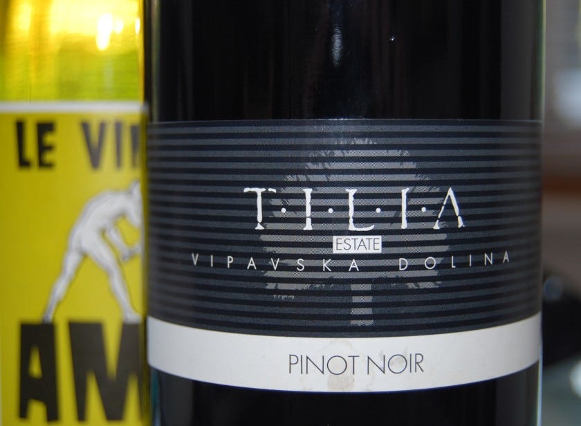
Slovenia-les-Beaune?

A modernist label for an excellent and quite traditional wine
Wine labels can tell you a lot about what's in the bottle - and by that, I don't mean alcohol percentages or the grape variety. The visual style of the label often drops a few clues about the target market, the aspirations of the wine maker and even the price point. Budget new world wines often favour bright, bold packaging to signpost bright, bold wines - while pricey classed growth claret or Burgundy tend to feature suitably aristocratic design motifs.
Take a look at the label on the right - to me, this says "modern", "accessible", "youthful" and probably somewhere in the mid-budget range. The Tilia Estate Vipavska Dolina 2008 is a Pinot Noir from Slovenia. Not having prior expectations of what that might involve stylistically, I made these initial assumptions before even pulling the cork. However, the liquid inside the bottle confounded almost all of them.
The attractive pale ruby colour, and a slightly stinky nose (in the…


